Form Validation Best Practices and React Implementation


Forms exist all across the web in nearly every platform. They are the means of collecting information for a variety of purposes. In this post we will walk through some best practices for aiding users in completing forms.
What is form validation?
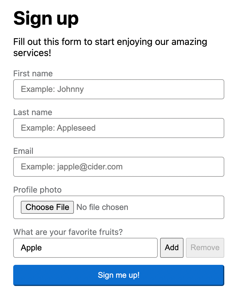
Form validation guides users to successfully complete a form, often using error messages describing what the user needs to correct in order to submit the form. Take the following form as an example.
Best Practices
This is not an exhaustive list, but we will touch on many key aspects of guiding users through forms.
- When to provide feedback
- Where to position feedback
- Provide clear feedback
- Guide the user
1. When to provide feedback
The color red and alerts showing up on a page can seem abrasive if not used appropriately. We don't want the user to feel like they are being yelled at, but rather want to guide them through their experience. When the user makes a mistake, it is at that time that we should provide feedback. By providing immediate feedback users complete forms faster than providing feedback only when they attempt to submit the form. Below are some specifics of when to start showing validation errors.
1. After the user has touched a field and navigated away without completing it correctly.
This is commonly known as a blur event in JavaScript. We want to give the user immediate feedback if they are jumping around the form without properly filling it out.
2. After the user has inputted invalid data into a field with a wait period of at least 400 milliseconds.
We don't want the user to feel like the form is screaming at them for every keystroke. Rather, it would be best to delay showing an error until they have finished typing. This is around 400 milliseconds for most users.
3. After the user has clicked on the submit button inside an invalid form.
If the user goes straight to clicking the submit button, this is a good time to reveal all errors in the form, and ideally, to focus the user on the first field that requires attention.
2. Where to position feedback
Position feedback as close to the associated field as possible. It is often best practice to place error messages either directly to the right of or directly below the field. This puts the feedback into context with which field needs to be corrected.
It is common to see all errors at the top or bottom of a form. Although this might give collective feedback of all things that need to be corrected, it is not as useful all on its own. There may be situations where this type of feedback is preferred. In that case, I recommend also showing errors near each field and providing links to the associated fields from this top-of-form feedback.
3. Provide clear feedback
For validation errors to be useful, they need to (1) convey what's wrong and (2) what action the user can take to correct the error.
Avoid using technical jargon.
It can be easy as a software developer to forget that not everyone knows binary and boolean operators. "There are only 10 types of people in the world: Those who understand binary and those who don't."
Rather than saying "Violation of primary key constraint 'username'", we can say "Sorry, the username 'wesley' already exists, please choose another username." This example showcases an error percolated from a database.
Another example is a dropdown menu for selecting contacts to send emails to. Rather than stating "Invalid mailing list id," we can clarify by stating, "Please select a contact list."
Be courteous.
By adding a little more wording, we can go from sounding commanding or passive to providing a guiding hand. Rather than saying "required field" or "invalid email", we can say "Please fill out this field" and "Please enter a valid email address."
Specific feedback on the next action the user should take to correct the error.
When possible, provide additional guidance for how the user can correct the error. Notice how with basic HTML5 form validation, there are 3 separate messages being used.
- Please fill out this field.
- Please include an '@' in the email address. 'a' is missing an '@'.
- Please enter a part following '@'. 'a@' is incomplete.
4. Guide the user
This has been mentioned in various flavors in the previous points, but merits a section of its own. Several tips to keep in mind:
- Keep submit buttons enabled. It can be confusing and sometimes frustrating when the button is disabled without any clear reason when entering a new form. When the user clicks the button and there are fields that are still invalid, direct the user's input to the first field that needs attention and display all validation errors.
- Use confirmation messages where appropriate. Some forms may be complicated for the average user. When valid information has been entered into a field, consider showing a green checkmark and text.
- Provide defaults when possible. If there is information that is commonly used on a form, pre-select defaults for the user. For example, if a user is exporting data and sending it via email, default to the user's email address in the form. If the user wishes to change this, they may do so, but the form is already closer to completion by using a smart default.
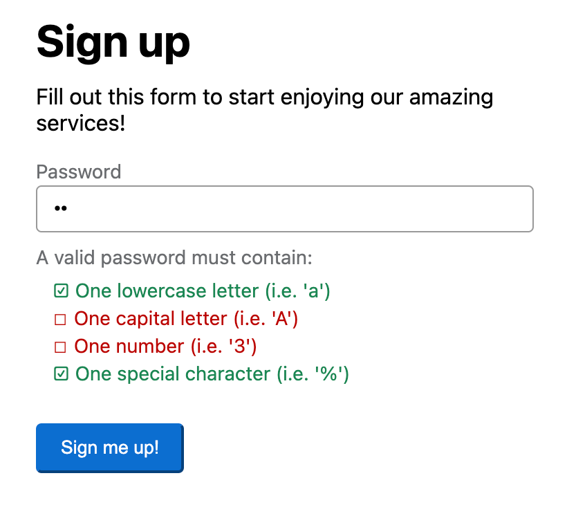
- Use guiding language in validation errors. There is sometimes more we can do than explain to the user that a field is required. For example, with a password, we can state, "Please enter a valid password. Passwords must contain: one lowercase letter, one capital letter, one number, and one special character." We could consider showing the 4 required parts as separate line items and displaying a green checkmark for each that has been successfully used.
Bonus!
Thought that was all, didn't you? We covered a lot and we can reach even more audiences with a few more touches.
Accessibility
Color Contrast: There are some great color contrast checking tools out there. It's important that every part of each form field uses good contrast ratios so those with color blindness can clearly distinguish the fields themselves and any color we may be using for meaning.
Screen Readers: To properly reach screen readers, we need to make use of some aria attributes. In most cases, you may only need aria-describedby. WebAIM has a great article on making forms more accessible if you want a place to start digging in deeper.
Disable a form during submission
It is common that once a form is submitted, it has a task to complete before sending the user elsewhere. There are many preferences here, such as hiding the entire form and presenting a loading display, whether a spinner or something else. In some cases, it may be appropriate to continue showing the form and just show a spinner on the submit button. In this case, it can be very useful to wrap the form fields in a fieldset element with the disabled attribute. This prevents us from having to disable each field in the form.
React Implementation
There are a few contending libraries out there. One that can do this well is React Hook Form. We can configure the form with the useForm hook.
useForm({
    mode: "all",
    delayError: 400
});
With mode being all we can trigger feedback when the user makes changes, moves away from a field, and submits the form.
With delayError we are specifying to not show validation errors until at least 400 milliseconds after the user is done typing.
FormProvider
It is definitely worth calling out that the FormProvider can be very useful, allowing us to hook into form methods and state in nested components without having to pass those down through properties. Then we can make use of the hooks useFormState and useFormContext. If you just want to watch a single field value useWatch is what you want.
Controlled Components
It's very common to be using controlled components, either built in-house or an open source library such as Material-UI. This is where you will want to make use of useController and Controller for properly registering controlled components with the form.
Dynamic Fields
For fields that allow adding to or removing from a list, the useFieldArray is what you're looking for.
Example CodeSandbox
Checkout a full example in the following CodeSandbox!
Conclusion
We didn't cover an exhaustive list, but we can definitely build some robust forms now with the knowledge we've acquired!
Additional Resources
If you are interested in upping your game, there is a breadth of additional resources out there.
 Sandrina Pereira
 Charmie Kapoor
 Edward Scott
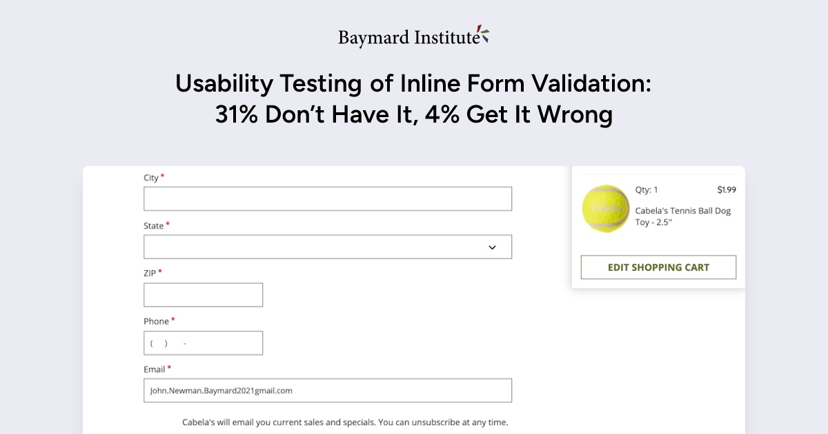
- https://designmodo.com/ux-form-validation/
- https://uxplanet.org/designing-more-efficient-forms-assistance-and-validation-f26a5241199d
- https://medium.com/@andrew.burton/form-validation-best-practices-8e3bec7d0549
- https://webaim.org/techniques/formvalidation/
- https://www.w3.org/WAI/tutorials/forms/validation/
- https://cantina.co/form-errors-screen-readers-can-access/
- https://hiddedevries.nl/en/blog/2017-04-04-how-to-make-inline-error-messages-accessible